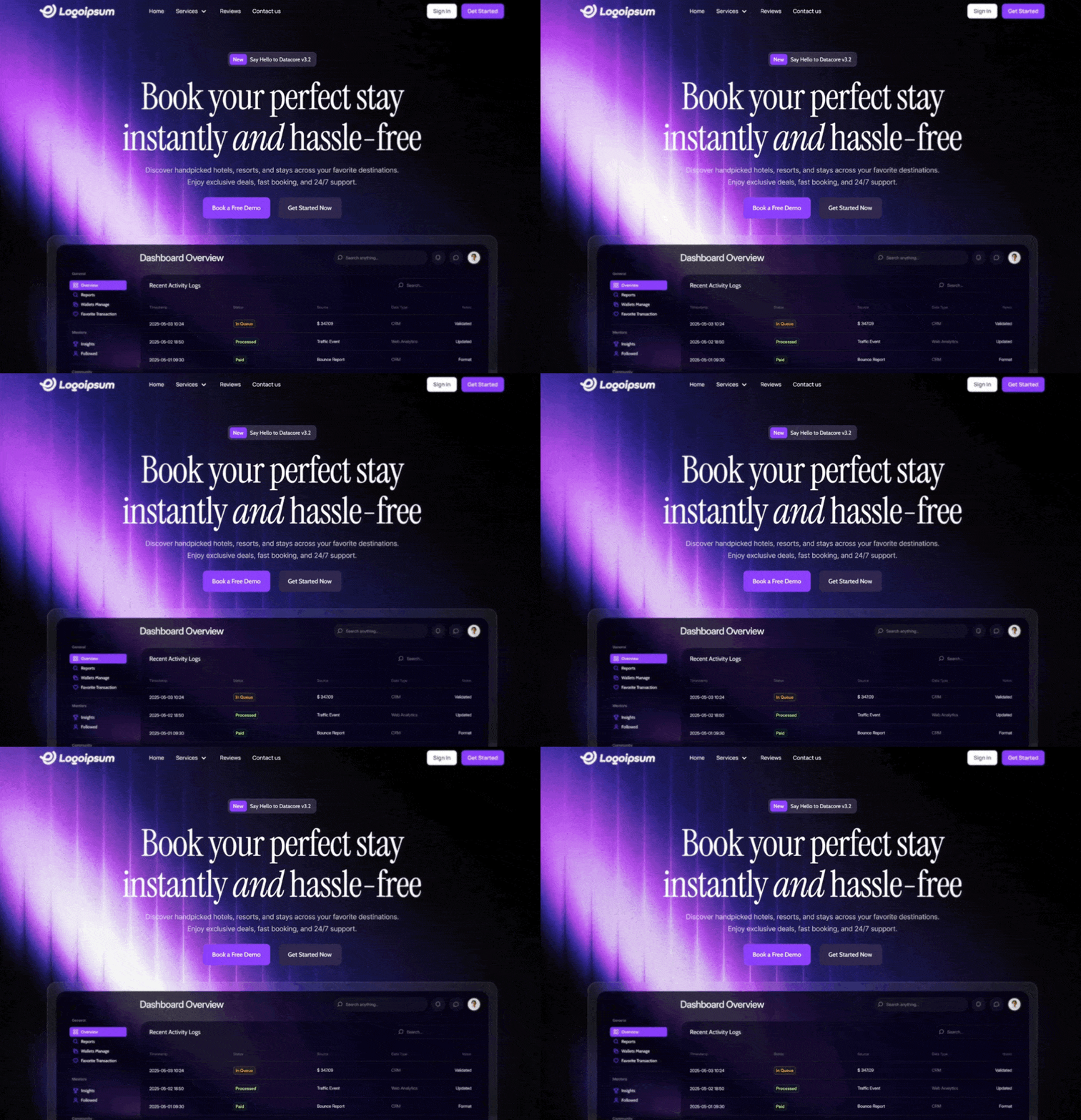
Create a responsive, full-screen hero section for a web application using React and Tailwind CSS. Design System & Assets: Fonts: Load and use 'Manrope' (for UI/Nav), 'Cabin' (for buttons/tags), 'Instrument Serif' (for headlines), and 'Inter' (for body text). Primary Color: Purple #7b39fc Secondary/Dark Color: Dark Purple #2b2344 Background: Use a full-screen, absolute-positioned HTML5 video background. The video should autoplay, loop, mute, and play inline. Ensure it covers the viewport (min-h-screen, object-cover) without an overlay (keep it opaque). Video URL: https://d8j0ntlcm91z4.cloudfront.net/user_38xzZboKViGWJOttwIXH07lWA1P/hf_20260210_031346_d87182fb-b0af-4273-84d1-c6fd17d6bf0f.mp4 1. Navbar Component (Top Overlay) Layout: Full width, transparent background, z-20 relative positioning. Padding: px-6 (mobile) to px-[120px] (desktop), py-[16px]. Logo (Left): Use this specific SVG path filled with white: Path: M1.04356 6.35771L13.6437 0.666504... (Future logo shape). Navigation Links (Center-Left, Desktop Only): Items: "Home", "Services" (with a ChevronDown icon), "Reviews", "Contact us". Style: Manrope font, Medium weight, 14px size, White. Hover effect: opacity-80. Action Buttons (Right, Desktop Only): Sign In: White background, thin gray border (#d4d4d4), rounded 8px, Black text (#171717), Manrope Semibold 14px. Get Started: Primary Purple background (#7b39fc), rounded 8px, White text (#fafafa), Manrope Semibold 14px, subtle shadow. Mobile: Hide links/buttons and show

……(完整源码请在站内查看)