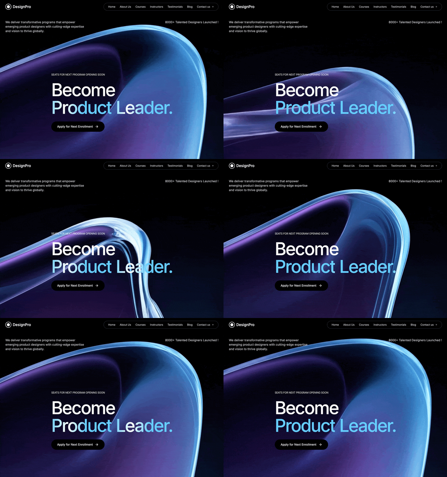
Create a full-screen hero section for a product design education platform called "DesignPro" with the following exact specifications: Background: Full-screen looping video background using this exact CloudFront URL: https://d8j0ntlcm91z4.cloudfront.net/user_38xzZboKViGWJOttwIXH07lWA1P/hf_20260328_105406_16f4600d-7a92-4292-b96e-b19156c7830a.mp4 Video should autoplay, loop, be muted, and play inline Background color: black (#000000) Navigation Bar: Logo: Circular design with a white border (2px), containing a smaller filled white circle inside, followed by "DesignPro" text Navigation links in a rounded pill container with gray-700 border: Home, About Us, Courses, Instructors, Testimonials, Blog, Contact us (with arrow icon) All nav links: white/80 opacity, hover to full white Font size: text-sm Mobile: Show hamburger menu icon on screens smaller than lg Max width: 7xl container with proper padding Content Layout: Top Section (below nav): Two-column layout on large screens, stacked on mobile Left column: "We deliver transformative programs that empower emerging product designers with cutting-edge expertise and vision to thrive globally." Right column (right-aligned on lg+): "8000+ Talented Designers Launched !" Both paragraphs: white/80 opacity, text-sm on mobile, text-base on desktop Hero Section (center): Small uppercase text above heading: "Seats for Next Program Opening Soon" (white/80 opacity, text-xs on mobile, text-sm on desktop, tight tracking) Main heading with these ex

……(完整源码请在站内查看)