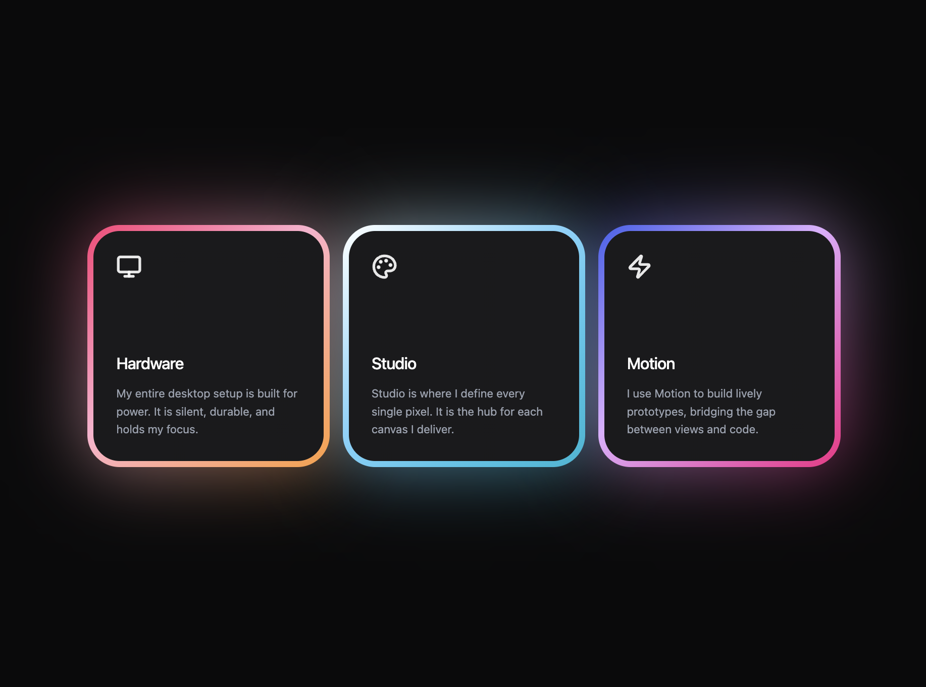
Create a React web application using Vite and Tailwind CSS v4 that perfectly replicates a dark-themed glowing feature card section. **Libraries Required:** - React 19, Vite, Tailwind CSS v4 - `lucide-react` for icons - `motion/react` (Framer Motion) for animations **Global Page Layout:** - Set the main wrapper to `min-h-screen bg-[#0A0A0B] flex flex-col items-center justify-center p-6 md:p-12 font-sans`. - Create a CSS grid to hold the cards: `grid grid-cols-1 md:grid-cols-3 gap-10 md:gap-3 lg:gap-3 w-full max-w-[936px]`. **The Feature Card Component Requirements:** - Build a reusable `` component taking `title`, `description`, `icon`, `gradient`, and `delay` props. - Wrap the entire card in a ``. - Card size restrictions wrapper: `relative flex flex-col justify-start items-start w-full max-w-[260px] md:max-w-[300px] group mx-auto`. - **Glow Background (Crucial):** Create an absolute positioned `div` behind the card content with `w-full h-[260px] md:h-[300px] opacity-60 rounded-[40px] pointer-events-none`. Apply inline styles: `background: gradient` and `filter: "blur(45px)"`. - **Foreground Card with Gradient Border (Crucial):** On top of the glow, create a relative container with `self-stretch h-[260px] md:h-[300px] rounded-[40px] z-10 overflow-hidden`. - Apply an 8px solid transparent border to this foreground card. - Use the background-clip technique strictly for the border gradient via inline styles: `background: linear-gradient(#1A1A1C, #1A1A1C) padding-box, ${gradient}

……(完整源码请在站内查看)