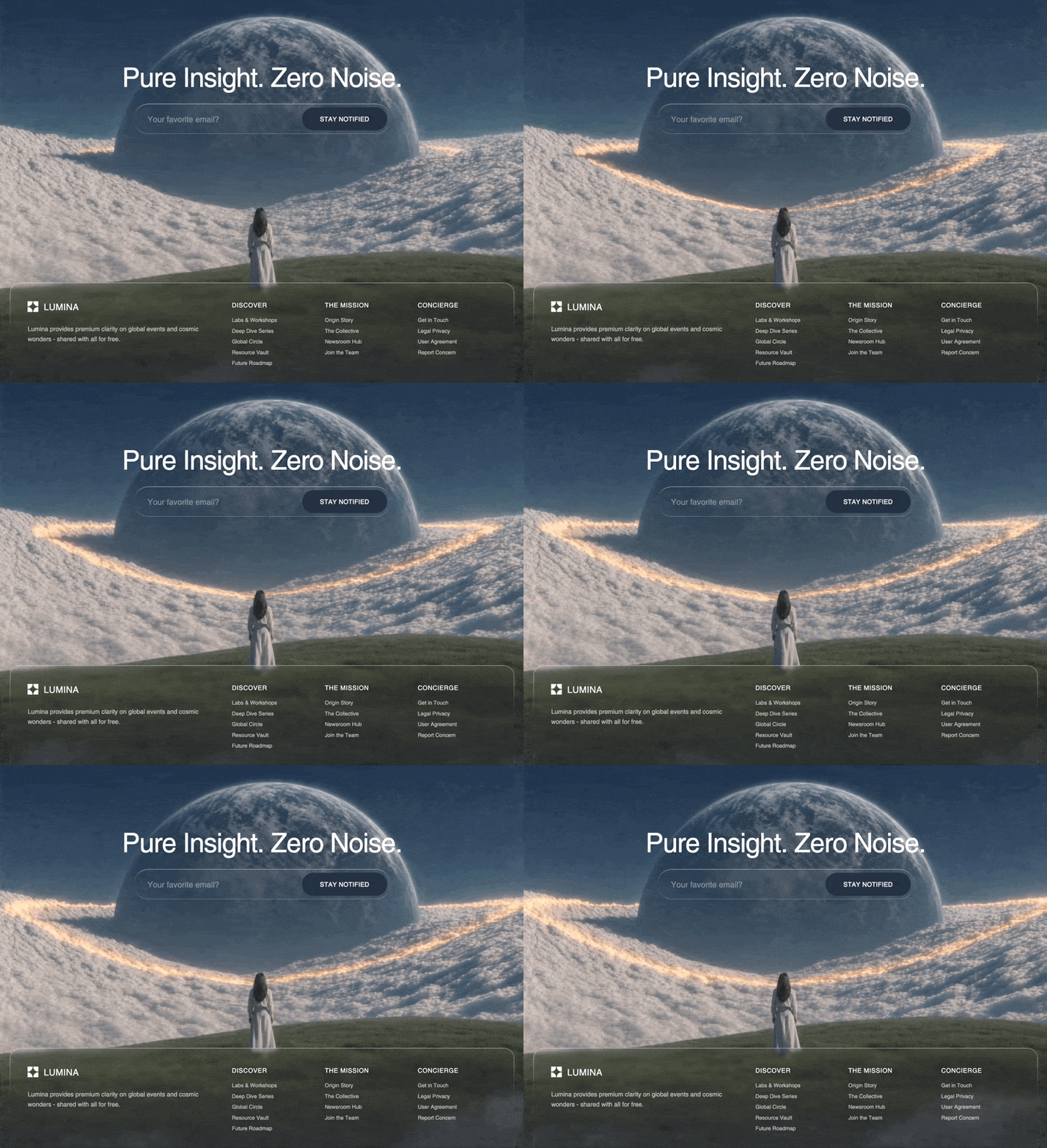
Create a React frontend using Tailwind CSS v4, the `motion/react` library for animations, and `lucide-react` for icons. I want to build a page with an immersive video background and a highly stylized "liquid glass" footer. Please follow these exact specifications: 1. Global CSS & Fonts (`index.css`): Add the following exact `@font-face` to the CSS file and set it as the root Tailwind `--font-sans`: @font-face { font-family: "Helvetica Regular"; src: url("https://db.onlinewebfonts.com/t/a64ff11d2c24584c767f6257e880dc65.eot"); src: url("https://db.onlinewebfonts.com/t/a64ff11d2c24584c767f6257e880dc65.eot?#iefix")format("embedded-opentype"), url("https://db.onlinewebfonts.com/t/a64ff11d2c24584c767f6257e880dc65.woff2")format("woff2"), url("https://db.onlinewebfonts.com/t/a64ff11d2c24584c767f6257e880dc65.woff")format("woff"), url("https://db.onlinewebfonts.com/t/a64ff11d2c24584c767f6257e880dc65.ttf")format("truetype"), url("https://db.onlinewebfonts.com/t/a64ff11d2c24584c767f6257e880dc65.svg#Helvetica Regular")format("svg"); } 2. The "Liquid Glass" CSS: Add this exact custom CSS for the liquid glass effect bordering: .liquid-glass { background: rgba(255, 255, 255, 0.01); background-blend-mode: luminosity; backdrop-filter: blur(4px); -webkit-backdrop-filter: blur(4px); border: none; box-shadow: inset 0 1px 1px rgba(255, 255, 255, 0.1); position: relative; overflow: hidden; } .liquid-glass::before { content: ''; position: absolute; inset: 0; border-radius: inherit; padding: 1.4px; b

……(完整源码请在站内查看)